Color of the Year 2019

Pantone’s Color of the Year Works at Cinnamon Shore
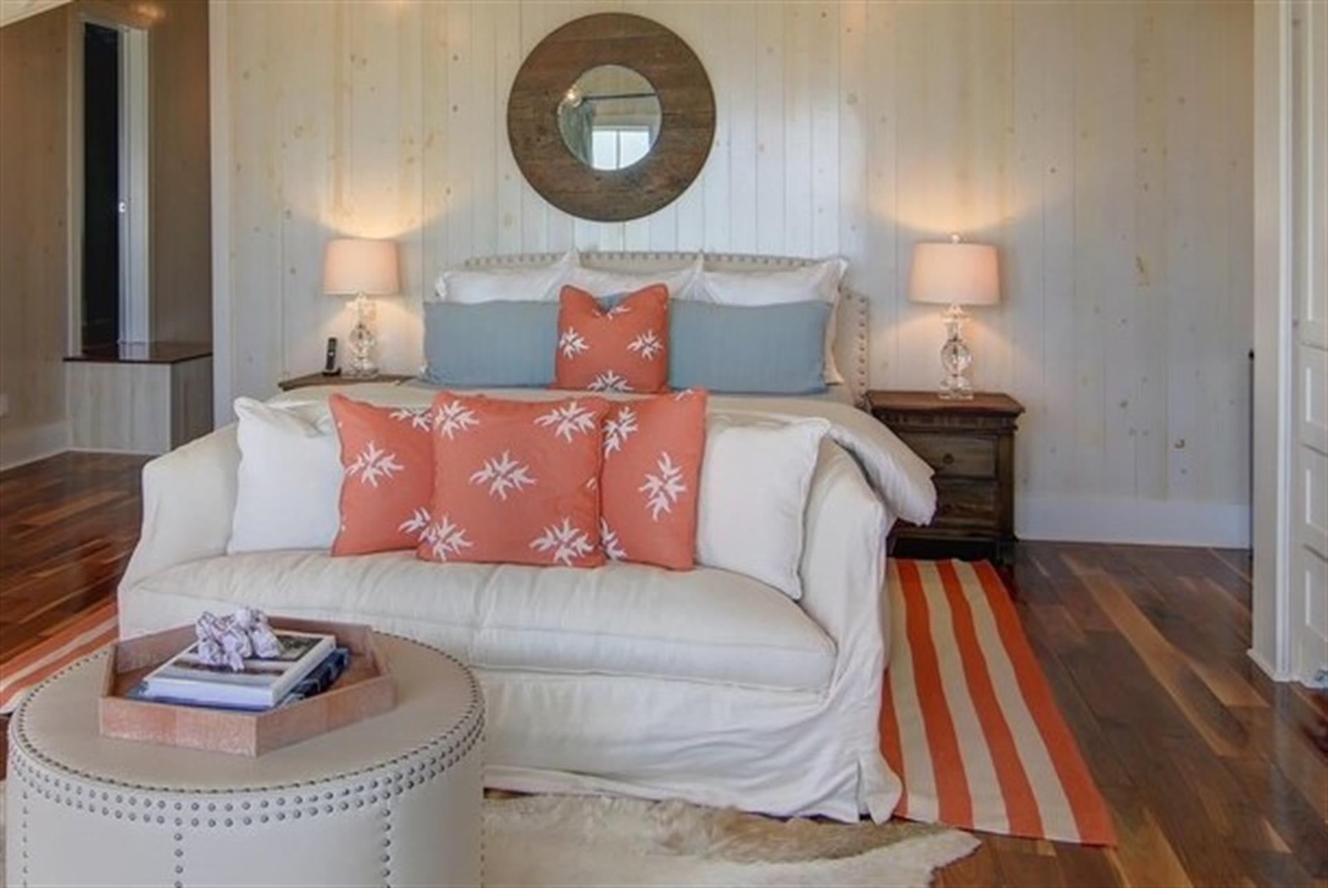
As bright and fun as a beach ball, this year’s Color of the Year from Pantone feels just right at the coast. We’re celebrating all things coral at Cinnamon Shore.
For 2019, the color gurus at Pantone selected PANTONE 16-1546 Living Coral, described as “an animating and life-affirming shade of orange with a golden undertone.” Perfect for the beach, it can brighten your life wherever you live.

Pantone sets professional color standards for the design industry, and its big reveal of the year’s trendiest color always makes a splash. At Cinnamon Shore we couldn’t help but notice the color is remarkably close to our very own logo’s happy hue.
So, why did Pantone pick Living Coral? In today’s busy, social-media-infused world, Pantone looked under the sea to the shelter that coral reefs provide in making its choice. The color, the organization says, offers “warmth and nourishment,” as it hints at both invigorating energy and the natural world. “Color is an equalizing lens through which we experience our natural and digital realities, and this is particularly true for Living Coral,” said Leatrice Eiseman, executive director of the Pantone Color Institute. “With consumers craving human interaction and social connection, the humanizing and heartening qualities displayed by the convivial Pantone Living Coral hit a responsive chord.”
Pantone says the color provides “comfort and buoyancy in our continually shifting environment.” Laurie Pressman, vice president of the Pantone Color Institute, adds that the shade “reinforces how colors can embody our collective experience and reflect what is taking place in our global culture at a moment in time.”
That’s quite a goal for a sliver of the color wheel. But Pantone takes its analysis seriously. The organization looks at how the color is showing up across industries, from product design to the beauty aisle at the local drug store, from social media usage to home décor.

In the interiors and furnishings sector, Pantone says the color works in several key ways:
- To make a bold statement. When used as primary color in a space, it’s playful and energetic.
- To indicate organic, human connection. You’ll see the color used in tactile expressions, from shag rugs to cozy blankets and plush upholstery.
- To offer a pop as an accent color. Experiment with a bright coral lamp, an accent wall color, or a tabletop display.
At Cinnamon Shore, designer Courtney Rangel has created a whole interior design board around coral tones for some the residences at the Tradewinds Outpost, which is currently under construction and almost finished along the Town Center. Her coral color palette will add unmistakable beachy fun to the interiors with bright accents.
Other condos and beach homes in our community rely on a coral-and-turquoise palette, as well. It’s just a natural combination at the shore, and you’ll see coral used often as an accent hue in our homes.
Read more about Pantone and Living Coral here, and watch to see where the color shows up when you’re out and about.
Our favorite place to see the coral, is on the coral-and-white striped umbrella on the beaches of Cinnamon Shore! Join us! For information about Tradewinds Outpost or other available properties call 361-749-1851.

Published on Friday, March 8, 2019