2022 Color of the Year!

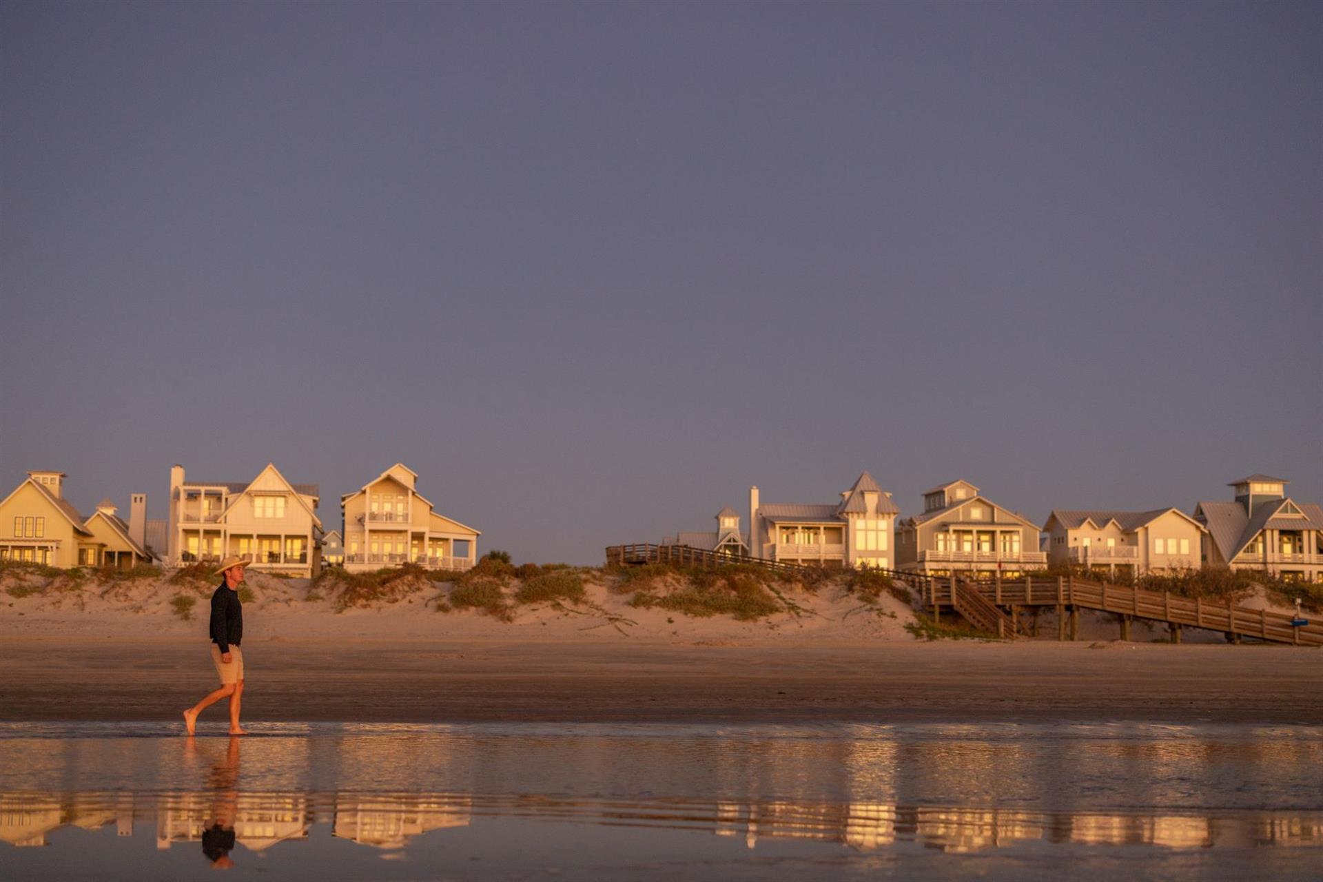
The official Color of the Year -- 'Veri Peri' -- resonates here at Cinnamon Shore!
It's a violet blue meant as a nod to the future, and ours is very bright -- for 2022 and beyond.
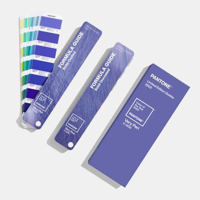
For the first time, the Pantone Color Institute created a brand-new, custom shade as its Color of the Year—a pretty periwinkle called Very Peri. With a “true blue” base and a jolt of red that invigorates, the new hue nods to the way our digital lives and the physical world have merged in a “fusion of modern life," it says. In Pantone's vision, the natural world merges with our digital lives as we emerge from the isolation of the pandemic.

The Institute explains the origin of its new periwinkle color: “Rekindling gratitude for some of the qualities that blue represents complemented by a new perspective that resonates today, Very Peri places the future ahead in a new light.”
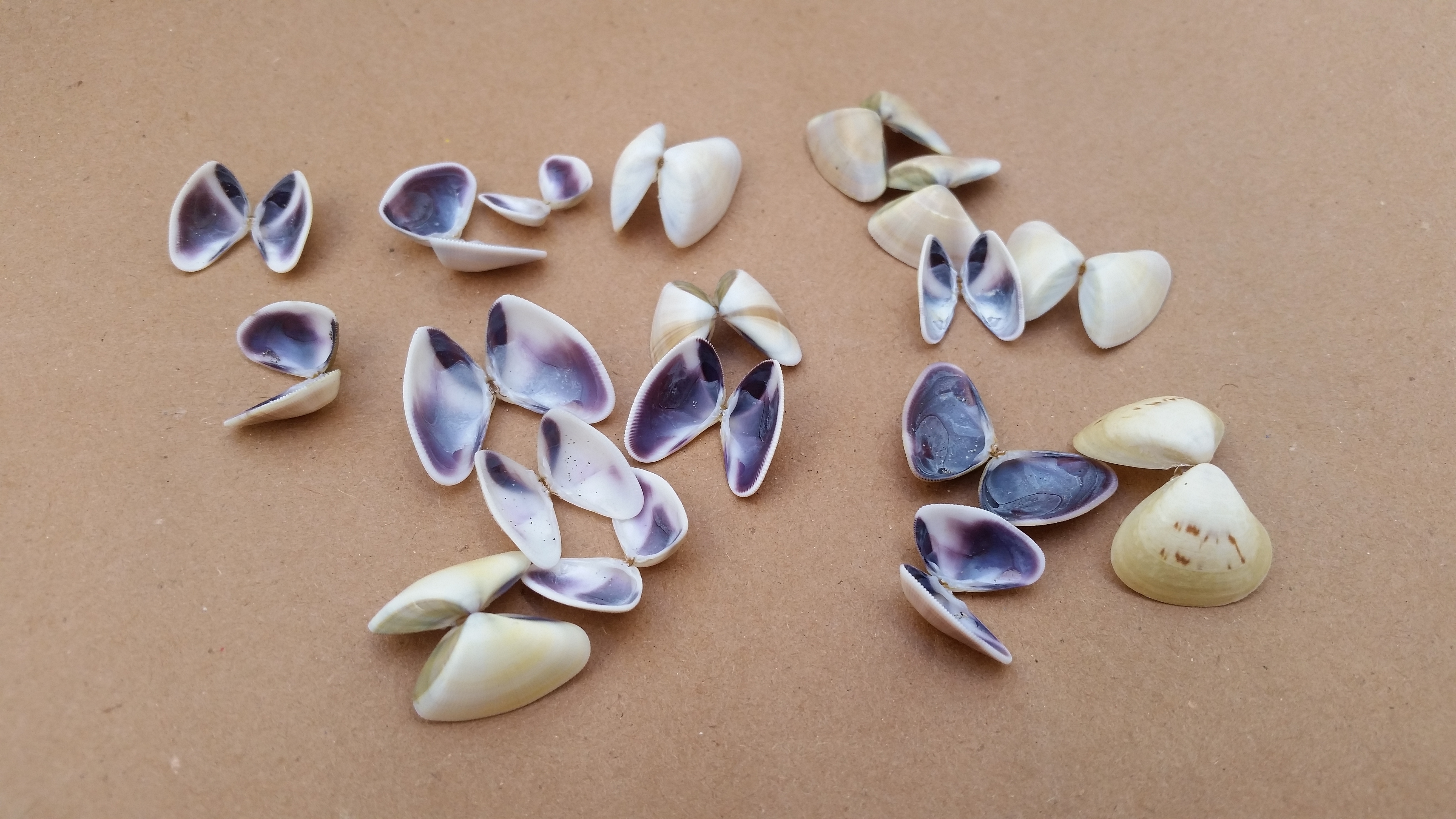
In the physical world of the coast, we see this vibrant periwinkle shade in morning skies, backing our row of Gulf Coast homes. We see it shimmer in a pelican's feathers as they soar overhead or flash in the iridescence of fish scales. It streaks sunset skies, curls inside Angel Wing seashells, or helps create pattern or accents against all-white beach home interiors.

How Veri Peri will influence the design world
Every year, the design world waits to see what color the Institute chooses, and it influences everything from the fashion world to home decor. According to the Institute, more than 10 million designers and producers around the world rely on Pantone products and services to help define, communicate, and control color from inspiration to realization. It helps these professionals achieve color consistency across various materials and finishes for graphics, fashion, and product design.

It's influential because the Pantone team usually looks not only at graphic design and color trends, but also at the culture and mood of the international community to select its color, indicated by a Pantone number and name. This year, that's PANTONE 17-3938 Veri Peri. The custom shade is meant to blend the "faithfulness and constancy of blue with the energy and excitement of red" -- all "to introduce an empowering mix of newness to apparel, beauty, home furnishings, product design, and packaging."
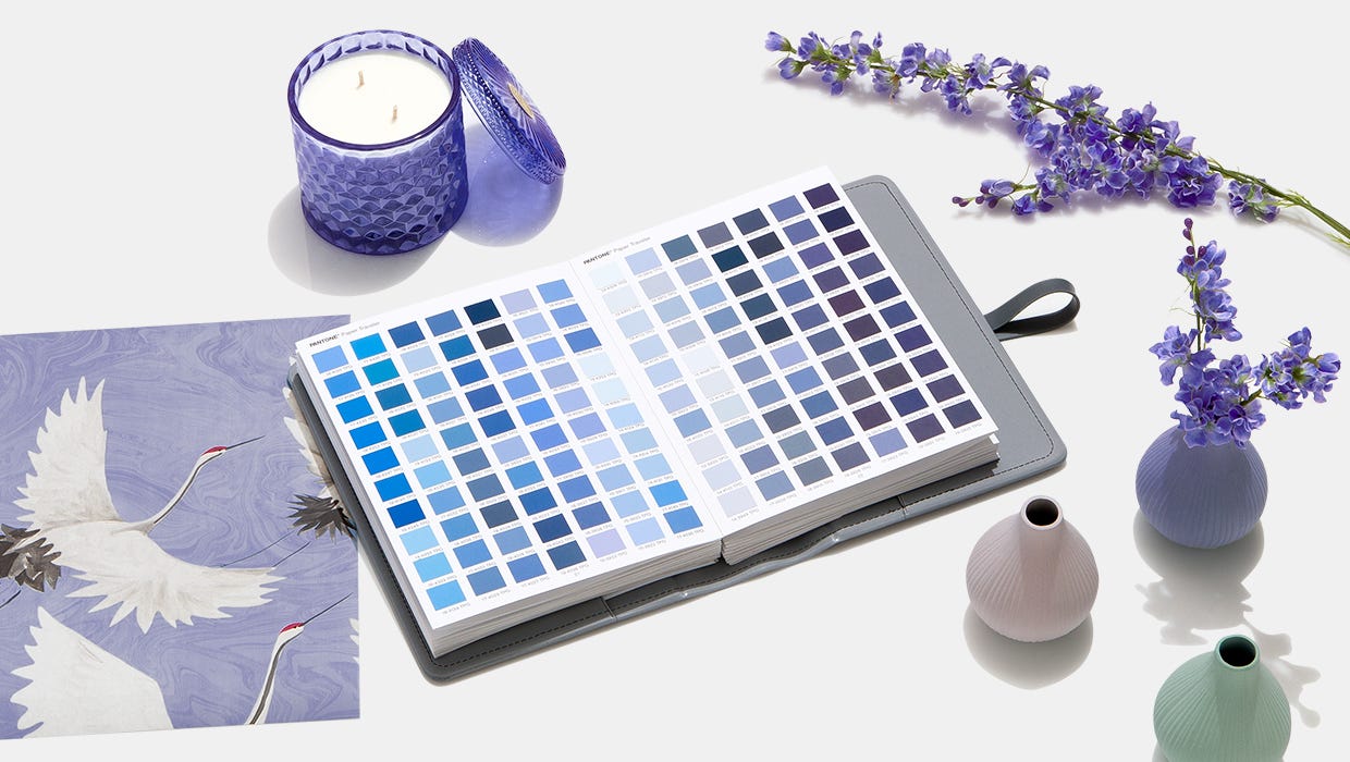
In home décor, it offers a “new modernity” to freshen spaces with an an accent wall or with a statement accessory, such as a vase, or part of a pattern or upholstery or wallpaper. At Cinnamon Shore, we understand the classic design mixed with an infusion of new elements. Similar colors to Pantone's particular periwinkle make an appearance in our vacation rental homes and around the community—as we’re gearing up for more growth.

Color as a symbol for the future
Pantone says it was influenced to create Veri Peri by the blue glow of our devices, which expand creativity and help dreamers dream. The red undertones reflect the energy of our emergence from a pandemic.
At Cinnamon Shore, we understand this convergence. We have merged a creative vision of the future of the Texas coast with the energy to make it happen.
In the coming year, we're adding new restaurants and retail to our Town Center and finishing out our Social Circle with a final, residential building. Our new village at Cinnamon Shore South is rising so rapidly we can hardly keep up with demand. We're introducing Cinnamon Shore Bay later this year, and a new community in an all-new marina is also on the drawing board. Our future is surging like the tallest of tides. It's inevitable. It's happening. And it's going to be beautiful.
Make Cinnamon Shore Part of Your Future
Book your vacation now ensure your future includes time at Cinnamon Shore!
Find out about new opportunities at Cinnamon Shore South

Published by Jennifer Chappell Smith
Tuesday, December 28, 2021